For two decades Cowgirl Creamery has played a vital role in the Bay Area sustainable food culture. We have worked with Cowgirl to grow their brand to an international level while keeping their local small town western feel.

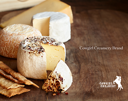
Cowgirl Creamery's new packaging, like their brand, is playful, yet it's a melding of elegant and approachable, rustic but with a dash of sophistication (think of the style as “Dolly Parton playing Carnegie Hall”). The new milky pastel color palette was introduced to differentiate their fresh cheeses from their aged cheeses. The colors were inspired by the light on the farms at sunrise and sunset when the grasses turn golden, and the sky moves from light blue to pink. The pastel colors were then purposely tempered by our choice in a light neutral background and the desaturated earthy secondary color used on the product name. This combination allows the packaging to look fresh and natural on the dairy shelves but still work together with the rustic barn wood aesthetic of the rest of the Cowgirl product line. The whimsical pattern motif on the containers is inspired by the stitching on cowgirl boots. (and if you look close, you’ll see some other hidden objects in the pattern like a horseshoe and a stirring spoon). "The sparkling logo on top is just us Cowgirls, having a little fun and standing apart from the crowd. We take our cheese seriously, but not ourselves." -quote from the Cowgirls .

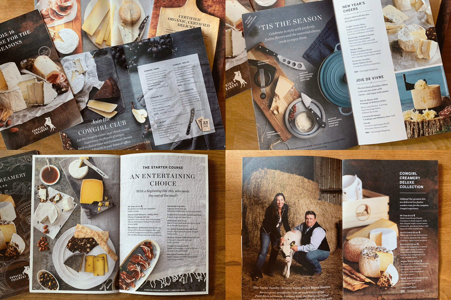
Mail Order is a large portion of the Cowgirls revenue stream. To increase sales and build the brand, we turned their standard product catalog into an aspirational, lifestyle piece with a new visual and level of storytelling, photography and print quality. Rumor on the street is that people save their catalog all year long.

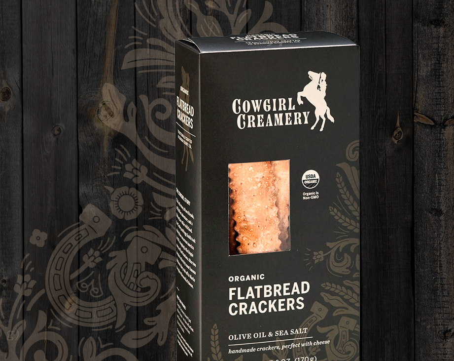
Cowgirl Creamery partners with Rustic Bakery to offer their famous Sea Salt and Olive Oil Flatbread cracker under the Cowgirl Name. We were tasked with designing packaging that used the same dieline template as the Rustic Bakery package but to make sure they could differentiate themselves if found side by side on grocery shelves. Obviously, we also had other goals including making the crackers look delicious and conveying the high-end luxury side of these crackers. We were excited to see that San Francisco International Airport replaced the Rustic Bakery Crackers with our Cowgirl Creamery Version! Giddy-up!

Whatever touchpoint we work on with Cowgirl, whether it's printed material, posters, POS, email marketing campaigns, or their website, we make sure we speak the Cowgirl Language.

